Color Pop Dining: How Vibrant Plates Are Replacing Minimalist Whites

Why restaurants are trading neutral tableware for joyful, dopamine-inducing palettes that make every meal a mood.
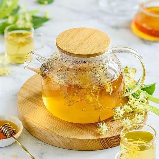
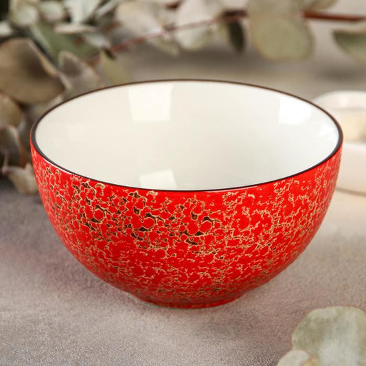
Goodbye, white plates. Hello, color. After decades of minimalism dominating fine dining — all clean lines and monochrome ceramics — the culinary world is finally bursting into color again. From neon-glazed bowls to pastel speckled platters, chefs and designers are embracing what experts are calling “dopamine dining”: a visual feast that makes you smile before you even take the first bite.
🎨 The Psychology of Plate Color
Studies show that color affects appetite, emotion, and perception. While white plates once reigned for their ability to “let the food shine,” today’s diners crave vibrancy and personality. “We eat with our eyes first — but now, we also eat with our feelings,” says tableware designer Carla Moreau. “Color brings energy, warmth, and playfulness — all the things we lost during the minimalist era.”
Chefs are finding that plating on colored surfaces doesn’t just elevate aesthetics — it changes how food tastes. A bright turquoise plate makes citrus flavors pop, while deep coral enhances rich umami tones. It’s not just about presentation — it’s about psychology on porcelain.
🍽️ The End of Minimalism
For years, the culinary elite swore by restraint. White, matte, perfectly imperfect ceramics ruled fine dining. But as the post-pandemic dining scene reemerged, something shifted. Diners wanted joy. They wanted vibrancy, escapism, and optimism — on the plate, not just on the palate.
Enter the Color Pop Movement: an antidote to the beige era. Chefs are plating beet carpaccio on teal, serving tiramisu on lemon yellow, and setting cocktails against lavender coasters. The result is unapologetically bold — and irresistibly photogenic.
🌈 Restaurants Leading the Charge
Across the globe, a new generation of restaurants is embracing color like it’s a brand identity. In Copenhagen, Atelier Sol plates minimalist Nordic fare on sunset-pink ceramics. In Los Angeles, Bloom Café features gradient pastel tableware that changes with the seasons. And in Tokyo, Kairo mixes neon-hued glass with iridescent cutlery — dining as design performance.
“We realized that diners photograph every course anyway,” laughs chef Marcus Tran of Palette in Melbourne. “So why not make the plate part of the art?”
📸 The Instagram Effect
There’s no denying that social media accelerated this shift. A brightly colored plate doesn’t just enhance a dish — it enhances engagement. Restaurants are curating entire tableware collections around how colors appear on camera. Think gradient ceramics, glossy surfaces, and unexpected contrasts that make every tablescape instantly “shareable.”
“White plates were the blank canvas era,” says stylist Naomi Chen. “Now, we’re in the pop-art era of dining.”
💡 Beyond Aesthetic: The Mood of Modern Dining
Color in dining isn’t just visual — it’s emotional. A coral bowl makes brunch feel like a celebration. A jade-green plate adds calm to dinner. The palette becomes part of the storytelling, a subtle way to communicate theme, mood, and memory. Restaurants are even aligning tableware colors with brand psychology — red for appetite, blue for calm, gold for indulgence.
It’s a holistic shift toward dining that delights all the senses. As chef Lara Kim puts it, “Color isn’t decoration anymore — it’s flavor without taste.”
🍋 The Future Is Bright
Expect to see more experimentation with color layering — matte against gloss, neon against neutral, and mismatched sets that feel artfully effortless. Tableware brands are launching “dopamine collections” — curated kits that bring playfulness to every meal. Even fine dining is loosening up, proving that elegance doesn’t have to mean restraint.
In 2025, dining is no longer monochrome — it’s a moodboard. The future is bold, joyful, and unapologetically colorful.
After all, food tastes better when the table smiles back.