Tables as Storytellers: How Restaurants Use Plateware to Set the Mood

Tables as Storytellers: How Restaurants Use Plateware to Set the Mood
Menus change. Playlists rotate. But the plate is the one element every guest photographs and physically holds. Today’s smartest restaurants treat dinnerware as a brand script—shaping emotion, enhancing flavor perception, and signaling values before the first bite.
By Staff • August 10, 2025
“Guests don’t just remember what they ate; they remember where the bite lived—a cool rim, a sandy glaze, a copper sheen.”
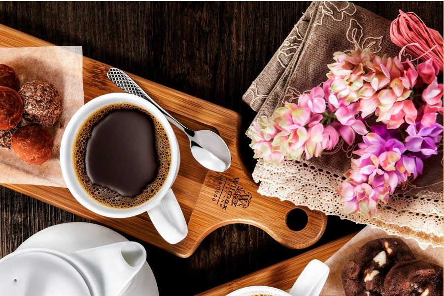
Why Plateware Tells Powerful Stories
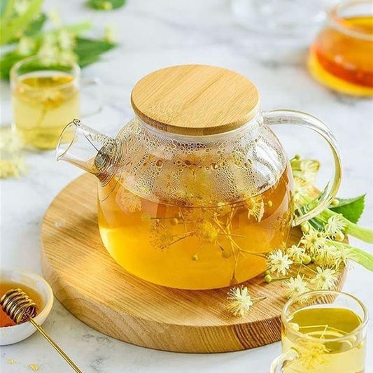
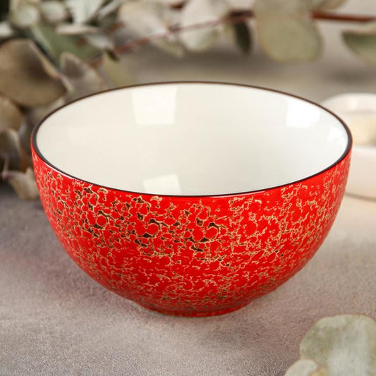
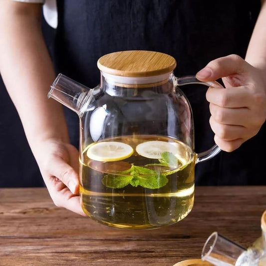
- Sensory framing: Matte clay softens glare and makes colors read richer; clear glass signals freshness; metal adds theater.
- Memory anchors: Unusual rims, carved rings, or tinted glass become recognizable in social posts—free branding with every share.
- Value codes: Recycled glass, local clay, or hammered copper telegraph sustainability, provenance, or craft.
Brand Storytelling Levers
Stoneware feels grounded; porcelain reads refined; glass suggests lightness; copper/brass suggest warmth and craft.
Neutrals give food the spotlight; deep tones (slate, forest) create intimacy; tinted glass sets a cocktail mood.
Reactive glazes and sand-matte rims add tactility—guests subconsciously read “handmade.”
Coupe plates enable negative space; shallow bowls cradle broths; asymmetry signals modernity.
Case Studies: Plates as Signature
Case 1 — Casa Brasa (Wood-Fired Latin)
Story arc: Fire, orchard, and earth. The team built a clay-forward set to echo roasted peppers and charred citrus.
- Hero piece: Sand-matte coupe with iron speckle—reads like hearth ash.
- Signature move: A tiny cobre sauce pan arrives table-side for smoky drippings.
- Mood effect: Warmth and generosity; guests linger and order another round of corn ribs.
Metric to watch: Average post count with branded hashtag increased when copper entered the frame.
Case 2 — North & Oat (Modern Nordic Bakery + Wine)
Story arc: Grain, frost, low sun. A cool palette reduces visual sweetness so pastries feel grown-up.
- Hero piece: Slate-blue reactive dessert plates that highlight blonde crumb and caramel shine.
- Glass cue: Rippling clear coupes for low-ABV vermouth spritz—like sunlight on ice.
- Menu tie-in: Oat milk panna cotta served in stoneware beakers—“from mill to table.”
Metric to watch: Pastry attach rate with spritz flight rose after switching to rippled glassware.
Case 3 — Harbor & Pine (Coastal Seafood)
Story arc: Fog and tide pools. The service team uses sea-mineral hues to cue salinity and freshness.
- Hero piece: Deep green bowl for clam chowder; outer rim matte, inner well gloss for photogenic sheen.
- Glass cue: Smoked-tint stemware with kelp oil droplets in martinis.
- Table ritual: Tiny copper pinch bowls for finishing salts—guests choose “storm” or “sun.”
Metric to watch: Conversion on raw-bar upsells increased when oysters moved to charcoal stoneware platters.
Case 4 — Umami Lab (Tasting Menu)
Story arc: Precision meets play. The team sequences plate shapes to match tempo—wide negative space for calm courses, tall rims for suspense.
- Hero piece: Charcoal porcelain with beveled well that frames dots of fermented sauces.
- Intermission: A clear glass “sound bowl” presents dashi granita; servers strike the foot lightly—sonic cue, memory anchor.
- Finale: Copper tray for mignardises under a cloche—reveal moment equals shareable content.
Metric to watch: Dwell time between courses shortened after shape sequencing reduced “visual fatigue.”
Designing a Cohesive System
Start with three base silhouettes—10–10.5" coupe, shallow bowl, dessert plate—and choose a glaze family that supports seasonal menus. Then layer a glass accent (rippled or tinted) and a metal accent (copper pinch bowls, sauce pans) for highlights.
| Mood | Clay/Glaze | Glass | Metal | Best For |
|---|---|---|---|---|
| Warm Rustic | Sand-matte with ash speckle | Amber tumbler | Hammered copper | Wood-fired, braises, corn breads |
| Coastal Mineral | Blue/green reactive | Smoke-tint stem | Brushed steel + copper salt bowls | Seafood, crudo, spritzes |
| Modern Noir | Charcoal porcelain | Clear, thin-rim glass | Mirror-polish steel accents | Tasting menus, plated desserts |
Operations: Durability, Cost & Care
- Durability: Choose vitrified stoneware (water absorption ≤ 0.5%) and tempered rims for glass. Test thermal shock with soup/ice service.
- Back-of-house flow: Standardize two stacking heights and foot-ring diameters to match racks; buy 10–15% overage for breakage.
- Cleaning: Use non-abrasive cleanser for grey marks on matte glazes; keep copper lacquered or polish weekly for consistency across photos.
- Cost control: Deploy the “80/20 rule”—80% core shapes, 20% hero pieces (odd shapes, metal) reserved for PR-worthy dishes.
Brand Plateware Playbook (Checklist)
Pick three adjectives (e.g., warm, mineral, precise). Every plate choice must support at least two.
Salads → wide coupe; broths → shallow bowl; desserts → small coupe or pedestal. Avoid “one plate fits all.”
Copper pour, smoked dome, or tinted glass reveal—repeatable drama becomes brand shorthand.
Track photo shares, attach rates, and table turns before/after plateware changes. Keep what moves the needle.
Key Takeaways
- Plateware is a brand channel, not just equipment.
- Material, color, texture, and form signal story before taste does.
- Hero pieces and small rituals create consistent social signatures.
- Operational planning keeps the look beautiful during real service.
Frequently Asked Questions
Start with three core shapes plus one hero piece per section (raw bar, hot, dessert). Limit colorways to two to keep racks simple.
They can. Counter with higher garnish, bright sauces, or a smaller well inside a dark rim to keep portions generous to the eye.
Introduce tinted glassware and copper salt bowls, then swap the dessert plate glaze. Small, high-visibility changes drive the most guest photos.
This guide is for creative and operational planning. Confirm compatibility and care instructions with your tableware supplier before purchase.