Tables as Storytellers: How Restaurants Use Plateware to Set the Mood

Tables as Storytellers: How Restaurants Use Plateware to Set the Mood
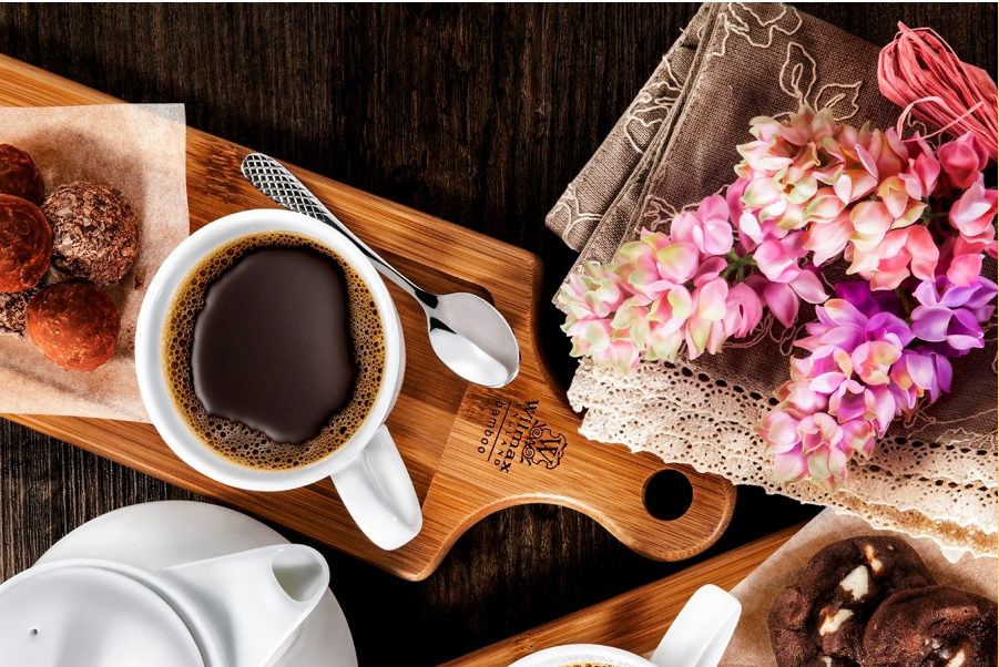
Menus rotate. Lights dim. Playlists change. But the plate is constant—held, photographed, remembered. The smartest restaurants treat dinnerware as a brand script, using material, color, texture, and form to pre-season expectations before the first bite.
By Staff • August 11, 2025
“Guests don’t just taste your food—they read the plate it lives on.”
Why Plates Tell Powerful Stories
- Expectation setting: Matte clay suggests rustic comfort; charcoal porcelain signals precision; colored glass whispers celebration.
- Flavor framing: Dark wells intensify greens and bright sauces; pale sand glazes soften the look of braises and baked goods.
- Memorability & shareability: Unusual rims, rippled glass, or tiny copper accents become recognizable in guest photos—the unpaid media every brand wants.
The Four Story Levers
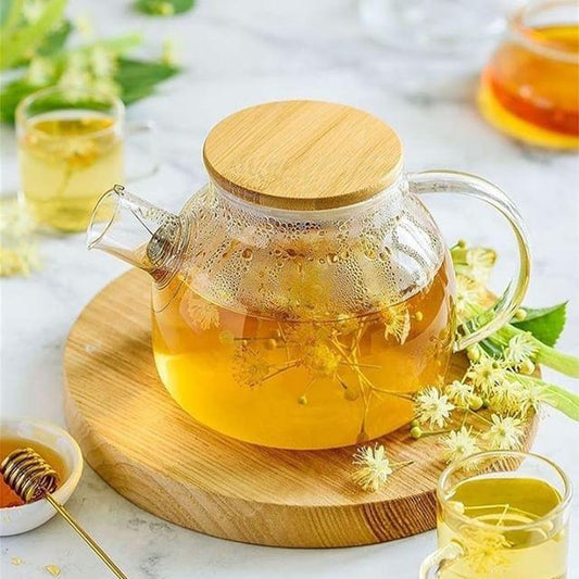
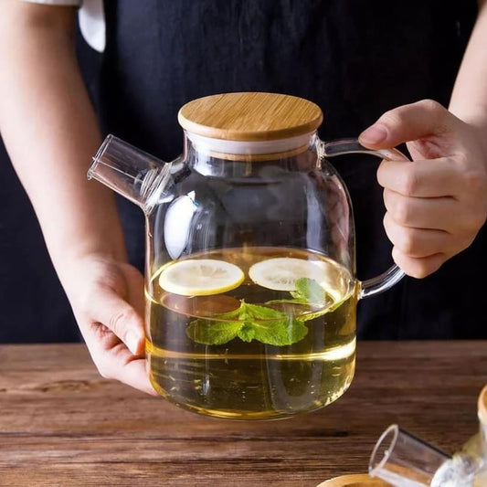
Stoneware grounds and warms; porcelain refines; glass lightens and lifts; copper or brass add theatrical sparkle for reveals and pours.
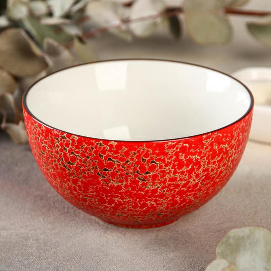
Neutrals spotlight food; mineral greens/blue-grays cue oceanic freshness; jet black cues modern minimalism and heightens contrast.
Reactive glazes, sand-matte rims, and rippled glass read “handmade,” adding tactility your guests actually feel.
Wide coupes create negative space for modern plating; shallow bowls cradle broths and grains; asymmetry adds motion.
Case Studies: Dinnerware as Brand Signature
1) Casa Brasa — Wood-Fired Latin
Mood: Hearth, orchard, fiesta.
- Hero piece: Sand-matte stoneware with iron speckle—reads like kiln ash, perfect for charred corn ribs.
- Signature ritual: Mini copper sauce pans for smoky drippings, poured table-side.
- Result: Higher share rates on mains; guests associate the copper pour with the brand’s fire story.
2) North & Oat — Nordic Bakery + Wine
Mood: Grain, frost, low sun.
- Hero piece: Slate-blue reactive dessert plates that make blonde crumbs and caramel tones glow.
- Glass cue: Rippling clear coupes for low-ABV spritz—like sunlight on ice.
- Result: Pastry + spritz attach rate climbed after switching to rippled glassware.
3) Harbor & Pine — Coastal Seafood
Mood: Fog, tide pools, wet stone.
- Hero piece: Deep mineral-green bowls: matte outer rim, glossy inner well for photogenic chowders.
- Table ritual: Copper pinch bowls with finishing salts labeled “storm” and “sun.”
- Result: Raw-bar upsells increased after oysters moved to charcoal platters with crushed-ice wells.
4) Umami Lab — Tasting Menu
Mood: Precision with play.
- Hero piece: Charcoal porcelain with beveled well—negative space becomes part of the composition.
- Intermission: Clear “sound bowls” for dashi granita; servers strike the foot softly—sonic branding.
- Result: Higher mignardise acceptance when served on burnished copper trays under cloches.
System Design: Cohesion Without Boredom
Build a core system, then rotate accents:
- Choose 3 silhouettes: 10–10.5" coupe, shallow bowl, dessert plate.
- Pick 1–2 glaze families: e.g., sand-matte + mineral reactive.
- Add a glass accent: rippled coupe or smoky stem.
- Introduce metal: copper salt bowls or sauce pans for moments of theater.
- Seasonal swap: change only dessert glaze or glass tint each quarter to refresh the feed without retooling BOH.
| Mood | Clay / Glaze | Glass | Metal Accent | Best For |
|---|---|---|---|---|
| Warm Rustic | Sand-matte, iron speckle | Amber tumbler | Hammered copper | Wood-fire, braises, corn breads |
| Coastal Mineral | Blue/green reactive | Smoke-tint stem | Brushed steel + copper salt bowls | Crudo, oysters, spritzes |
| Modern Noir | Charcoal porcelain | Thin-rim clear | Mirror-polish steel | Tasting menus, plated desserts |
Operations: Durability, Cost & Care
- Durability: Vitrified stoneware (water absorption ≤ 0.5%) and tempered rims for glass. Test thermal shock with soup/ice service.
- Back-of-house flow: Standardize stacking heights and foot-ring diameters; buy 10–15% overstock to cover breakage.
- Cleaning: Non-abrasive cleanser for grey marks on matte glazes; lacquered copper slows patina for photo consistency.
- Cost control: The 80/20 rule—80% core shapes, 20% hero pieces reserved for PR-worthy dishes and reveals.
Brand Plateware Playbook (Checklist)
Example: warm, mineral, precise. Every piece should serve at least two.
Salads → wide coupes; broths → shallow bowls; desserts → small coupes or pedestals. Avoid “one plate fits all.”
Copper pour, smoked cloche, tinted-glass reveal. Repeatable theater becomes brand shorthand.
Track photo shares, attach rates, and table turns before/after plate changes. Keep what moves the needle.
Key Takeaways
- Plateware is a brand channel, not a backdrop.
- Material, color, texture, and form cue the story before taste does.
- Hero pieces and small rituals create recognizable social signatures.
- Operational planning keeps the look beautiful during real service.
Frequently Asked Questions
Start with three core silhouettes plus one hero piece per section (raw bar, hot line, dessert). Limit colorways to two to simplify racking and replacement.
Sometimes. Offset with taller garnish, bright sauces, or a smaller recessed well inside a dark rim to maintain generosity to the eye.
Introduce tinted glassware and copper salt bowls, then swap only the dessert glaze. Small, high-visibility changes drive the most guest photos.
This guide is for styling inspiration and service planning. Confirm specifications and care with your vendor before purchase.